Launcher 10
- 3.8
- Rating
- 1.00M
- Installs
- Free
- Price
 Analysis by App-foxy
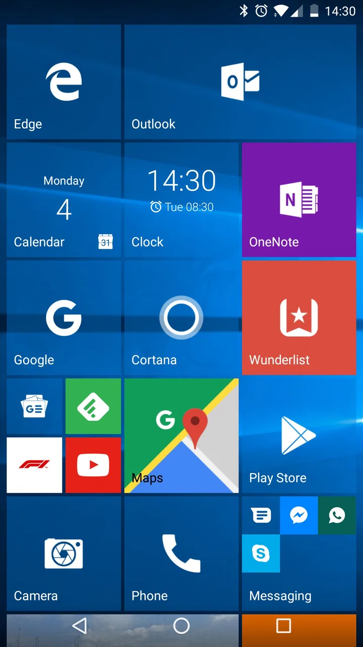
I approached Launcher 10 as a replacement for the standard Android home screen, not as another app to open occasionally. That distinction matters. A launcher changes the first screen I see, the way I reach apps, and the amount of visual noise I tolerate every day. Built by nfwebdev, this free personalization app takes a tile-focused approach inspired by the Windows Phone style, while still leaving enough room for Android habits such as widgets, folders, and familiar app access.
My first impression was that it feels more deliberate than a typical stock launcher. Instead of presenting a loose grid of icons, it encourages me to think in blocks: communication, work, media, travel, and the tools I use most. That makes the home screen feel less like a storage shelf and more like a dashboard. It is not perfect, and it is not aimed at people who want the most conventional Android experience, but it has a clear personality that many alternative launchers lack.
Building a baseline workflow that stays usable
The best way to start with Launcher 10 is not to reproduce every detail of another phone immediately. I found it more useful to decide what I actually need on the first screen. A practical setup is to reserve the most visible area for apps that support repeated actions: messages, phone calls, calendar, maps, music, camera, and one or two work tools. Less frequent apps can remain available through the app list rather than competing for attention on the main page.
You May Also Like

 Blood Strike: 2.5 Anniversary
Blood Strike’s Loadouts Turn Every Drop Into a Tactical Gamble
A close look at Blood Strike’s custom loadouts: how fast access to signature weapons reshapes its battle royale rhythm, rewards preparation, and narrows the gap between fights.

 Pandora - Music & Podcasts
Pandora’s Music Is Easy to Start, but Harder to Recover
Pandora’s strength is its low-effort path from a seed to a station. Its weak spot is how much confidence it asks you to place in connection, setup, and quiet recovery.

 8 Ball Pool
 Is Built on Rivalries, Rematches, and Routine
A close look at the rivalries, rematches, shared routines, and unanswered safety questions that turn a quick pool match into a persistent mobile community.

 Samsung Music
’s Quiet Strength Is Playing What You Already Own
Its reach comes less from spectacle than from dependable access to a personal library. That simplicity is both the app’s strongest retention engine and its ceiling.

 AccuWeather: Weather Radar
AccuWeather Review: A Quick, Clear Forecast for Everyday Decisions
For everyday plans, the best forecast is the one you can understand quickly. AccuWeather makes rain timing, radar, and local conditions easy to act on, with a few trade-offs.

 Hill Climb Racing
Why Hill Climb Racing Still Turns Crashes Into One More Run
A tiny car, a bumpy hill and one more upgrade: Hill Climb Racing keeps resurfacing because its simple chaos makes every near-miss feel personal.
More From Our News Desk



This approach is especially helpful if your current Android home screen has become crowded. Stock launchers often make it easy to add icons but offer little encouragement to remove them. Launcher 10 gives me a reason to rethink that habit because its tile arrangement looks better when each block has a purpose. I would rather have a smaller group of clearly placed tiles than several pages of duplicated shortcuts that I forget about.
For an everyday example, imagine leaving home in the morning. I can keep a weather tile, calendar access, navigation, transit or rideshare tools, and messages together in one visual area. At work, a separate group can hold email, notes, cloud storage, and an authenticator. In the evening, media and smart-home controls can occupy another section. The benefit is not that any one tap becomes magical; it is that the placement becomes predictable. After a few days, my hand starts moving to the same places without searching.
That predictability is the real strength of this launcher. It rewards users who are willing to create a system and stick with it. If I keep moving icons around whenever I feel bored, the advantage disappears. I also noticed that the tile design can make a small collection of favorite apps feel more substantial than a plain icon grid, while still keeping the screen relatively easy to scan.
There is a useful trade-off here. A tile-based layout can communicate grouping and importance better than a conventional grid, but it may use space less efficiently. Someone who installs many apps and expects every one to be visible at once may find the arrangement restrictive. I would not choose it for a phone where I constantly browse dozens of icons from the home screen. For that type of use, a more traditional launcher with dense grids and extensive drawer controls is likely faster.
How I organize the first screen
I recommend beginning with only the apps used several times a day. Put the most important actions where your thumb naturally reaches them, rather than arranging everything by color or by the order in which the apps were installed. A tile that looks attractive but leads to an app I rarely open is still wasted space.
One practical trick is to treat the first screen as a short list of decisions. What do I need when I wake up? What do I need while moving around? What do I need when I am communicating? The answers usually produce a cleaner arrangement than trying to design a decorative screen first. Once the workflow works, I can add visual touches without damaging the navigation pattern.
I also prefer to keep related actions close without overfilling one area. For example, camera, gallery, and photo editing belong together, but I would not place every social network beside them simply because all of them involve images. Grouping by the action I am about to perform is more useful than grouping by a broad theme.
Settings worth checking before daily use
Launcher 10 is highly configurable, so the initial setup deserves attention. The biggest mistake would be treating the default arrangement as the final one. I spent more time deciding how the screen should behave than choosing individual colors. That made the launcher feel faster because the visual design supported my habits instead of forcing me to adapt to it.
Start with the layout and spacing. A compact arrangement can show more information, but it may also make tiles feel cramped and reduce the visual separation between groups. A more generous layout is easier to read at a glance, especially when the phone is used while walking or when the screen is viewed quickly between tasks. I would choose clarity over maximum density unless I regularly need many shortcuts immediately.
Then examine how the app list fits into your routine. The home screen should not carry the burden of every installed app. I use the main layout for repeated actions and rely on the broader app list for occasional tools. This division prevents the first screen from becoming a second app drawer. It also means I can keep the launcher visually calm without losing access to less common apps.
Tile appearance is another area where restraint helps. Strong colors and large blocks can make the interface distinctive, but too many competing colors make categories harder to recognize. I prefer assigning a visual role to a group and repeating that logic. Communication can share one style, work another, and entertainment a third. The exact choices are personal; the important point is that the pattern remains stable.
Widgets require a little judgment as well. Android widgets can be useful, but they may interrupt the clean tile rhythm that makes this launcher appealing. I would add a widget only if it replaces a repeated trip into an app, such as checking a calendar or controlling media. A decorative widget that merely fills an empty area usually adds clutter rather than value.
It is also worth testing the arrangement with one hand. A layout that looks balanced while editing may feel awkward during real use. Keep high-frequency actions within comfortable reach and allow less urgent information to occupy the harder-to-reach areas. This is one of those small decisions that has more impact than changing the wallpaper repeatedly.
Because the app is free, it is easy to experiment without committing money up front. There are optional in-app purchases ranging from forty-nine cents to six dollars and forty-nine cents per item, so I would first establish whether the core experience suits me before considering any paid extras. The important question is not whether the launcher can be made attractive; it is whether I still enjoy using the arrangement after the novelty fades.
Small setup choices with a large effect
I found it useful to take a screenshot of the initial home screen before making major changes. That gives me a reference point if a new layout becomes confusing. It also makes experimentation less stressful: I can try a more aggressive organization without worrying that I will forget what worked.
Another good habit is to change one category at a time. If I alter tile sizes, colors, widget placement, and app groups simultaneously, I cannot tell which decision improved or harmed the experience. A slower setup produces a more reliable result, particularly for people who use the phone for work and cannot afford to lose familiar access points during the day.
Users should also remember that a launcher is deeply tied to Android behavior. Launcher 10 replaces the home screen experience, but it does not turn every app into a tile-aware application. Some apps will still look and behave exactly as they did before. That is not a flaw in this specific design; it is simply the boundary between customizing the launcher and changing the operating system.
Faster patterns for repeat actions
Once the layout is stable, the next improvement comes from reducing searches. I try to place apps according to the moment in which I use them, not according to their developer or category in the app store. A banking app may belong near bills and finance tools, while a document scanner may belong near email and cloud storage because that is the workflow it supports.
This creates useful chains. I might open the camera, review an image, edit it, and send it. Keeping those tools near each other reduces the mental effort of switching between unrelated parts of the screen. Likewise, calendar, maps, and messaging work well together when I am coordinating an appointment. These are simple arrangements, but they are more valuable than merely placing popular apps in prominent positions.
Shortcuts should be treated as actions rather than app names whenever the launcher and the app support them. If an app offers a direct shortcut to compose a message, create a note, or open a particular function, placing that shortcut where I normally launch the app can remove an intermediate step. I would verify each shortcut after setup because Android apps do not all expose the same options, and updates can change what is available.
Folders can help, but I would use them selectively. A folder containing a few related tools is manageable; a folder containing every app I rarely use becomes a miniature maze. Launcher 10 works best when the first screen communicates a clear structure, so hiding too many unrelated items behind folders undermines that benefit.
One of my favorite workflow ideas is to create a “handoff” area. This is a group of apps used when one task passes into another, such as notes, email, cloud storage, and messaging. It is particularly useful for work that begins with information captured on the phone and ends with that information being shared. The arrangement is more efficient than organizing apps only by brand or by the type of content they handle.
Another practical pattern is a temporary project layout. If I am traveling, moving, studying, or managing an event, I can bring the relevant apps together for that period and later restore a simpler everyday arrangement. This is where the launcher’s customization becomes more than decoration. The home screen can reflect the current phase of life instead of remaining frozen around habits I no longer have.
There is a caution, though: frequent redesign can create its own friction. I would not rebuild the screen every week. A repeatable layout is valuable because I can reach it automatically. If a temporary arrangement is needed, I would make a small, clearly defined change rather than redesigning the whole phone.
Advanced limits and who should choose something else
Launcher 10 has a strong visual identity, and that identity is both its appeal and its main limitation. People who want a neutral Android interface may find the tile-based presentation too opinionated. If I prefer a minimal text launcher, an icon-free setup, or a highly technical launcher built around gestures and automation, another option may suit me better.
It is also not the ideal choice for users who expect every home-screen element to behave like a live information panel. The tile concept suggests rich visual updates, but the usefulness of any live content depends on the individual app and Android compatibility. I would choose this launcher for organization and appearance first, not on the assumption that every tile will provide dynamic information in the same way.
Power users should think about backup and migration before investing heavily in a complex layout. A carefully arranged launcher is part of a daily workflow, so changing phones or resetting the device can make the setup process important. I would keep a written note or screenshot of the arrangement and the groups I rely on. That is sensible with any third-party launcher, especially when the home screen has become central to how I work.
Compatibility matters too. Launcher 10 supports Android from version 6.0 onward, which covers a broad range of devices, but the experience can still vary with screen size, manufacturer software, navigation mode, and Android’s own restrictions. On an older or heavily customized phone, I would test basic actions such as returning home, opening the app list, using widgets, and switching between apps before committing to a full redesign.
The app has been available since April 29, 2016, and the current release is version 2.8.19. That gives it a mature feel rather than the impression of a brand-new experiment. At the same time, long-term users should still judge it by how well it fits their present device and routines. A mature launcher can be reassuring, but it does not remove the need to check whether the interface feels comfortable on a particular screen.
Its Everyone content rating makes it approachable for a broad audience, including someone who simply wants a different home screen without a complicated learning curve. Still, “easy to try” does not mean “right for everyone.” I would skip it if my priority were maximum app density, extensive gesture automation, or a completely invisible launcher that stays out of the way. A conventional Android launcher is the safer choice for users who do not want to reorganize their habits.
The public response suggests a substantial user base, with an average rating of 3.8 from around fourteen thousand ratings and more than one million installs. I read that as evidence of a recognizable niche rather than universal approval. The rating feels consistent with my experience: the concept is appealing and distinctive, but the same design decisions that delight one person can frustrate another.
My verdict after making it part of the routine
Launcher 10 is at its best when I use it as a visual workflow tool. Its value comes from deciding what belongs on the first screen, arranging those actions by real-life sequence, and resisting the urge to fill every available space. The launcher does not automatically make Android faster, but it can make my own behavior more consistent, which often produces the same practical result.
I would recommend it to someone who likes the Windows Phone-inspired tile look, wants a more structured alternative to the usual icon grid, and is willing to spend time arranging the screen. It is particularly good for people who divide their phone use into clear areas such as communication, work, travel, and entertainment. The ability to shape those areas gives the app a personal quality that a standard launcher often lacks.
I would be more cautious with someone who changes phones frequently, depends heavily on advanced automation, or expects a launcher to provide a dense command center for a very large app collection. That person may be happier with a launcher designed around gestures, compact grids, or deeper system integration. Launcher 10 asks for a little cooperation from the user; it is not simply a visual skin that works equally well with every habit.
For me, the deciding factor is repeatability. After the screen is organized, I can stop thinking about where things are and focus on the task itself. That is a modest benefit, but it appears dozens of times during a normal day. The smartest way to use Launcher 10 is to design fewer, clearer paths and then leave them alone long enough to become automatic.
As a free personalization app from nfwebdev, it is easy to test without making the decision feel permanent. I would install it, build one practical layout, use it through a normal week, and pay attention to the moments when I still search or hesitate. If those moments decrease, the launcher is doing its job. If the tile arrangement keeps getting in the way, returning to the usual Android home screen is not a failure; it simply means a different kind of launcher matches the way you use your phone.
FAQs for Launcher 10
01What is Launcher 10, and how does it change the Android home screen?
Launcher 10 is an Android launcher designed to give your phone a Windows Phone-inspired interface. After installation, it replaces the standard home screen with a tile-based layout, allowing you to organize apps into colorful tiles and scrolling sections. It is mainly aimed at users who want a different visual experience from the usual Android grid, while still accessing familiar Android apps and system features.
02Can I customize the tiles, appearance, and layout in Launcher 10?
Yes. Launcher 10 provides several customization options so the home screen can be adapted to your preferences. You can generally resize and rearrange tiles, create groups, change colors, select wallpapers, and adjust visual details such as spacing or icon presentation. Some advanced personalization features may depend on the launcher version or require an optional upgrade, so it is worth checking the available settings after installation.
03Does Launcher 10 affect my existing apps, files, or Android settings?
No, Launcher 10 does not normally delete or modify your installed applications, personal files, photos, or core Android settings. It works as an alternative home-screen application, meaning you can return to your previous launcher whenever you want. During setup, Android may ask you to choose Launcher 10 as the default home app, but this selection can be changed later through the device’s default-app settings.
04Is Launcher 10 free to download, and are there advertisements or paid features?
Launcher 10 can typically be downloaded and used without paying, but the free experience may include advertisements or limitations on certain customization tools. Depending on the version available in the app store, premium options may unlock additional tile styles, appearance controls, or an ad-free experience. Before downloading, review the current store listing and in-app purchase information because pricing and included features can change.
05Does Launcher 10 work well on every Android phone?
Launcher 10 should work on many modern Android devices, but the experience can vary according to the phone model, Android version, screen size, and manufacturer software. Older or entry-level devices may show occasional delays when loading animated tiles or switching between screens. Some permissions, gestures, widgets, or notification features may also behave differently across brands, so compatibility should be confirmed in the Google Play listing before installation.
Pros
- Windows Phone-style interface feels familiar and distinctive.
- Live tiles provide quick access to updates and app information.
- Extensive tile customization supports different homescreen layouts.
- Smooth performance on most modern Android devices.
- Optional backup features make it easier to restore your setup.
Cons
- The free version includes advertising and limits some customization options.
- Some advanced features require a paid upgrade or subscription.
- Live tile updates may use additional battery and background data.
- Certain widgets and apps may not integrate perfectly with the launcher.
- The interface can feel crowded until tiles are carefully organized.

Launcher 10
Gallery